It´s all about branding: Packaging customization
The history of packaging - Parth three
Colours, shapes and imprinting – how bottles, cans, etc. evolved from practical storage containers into means of communication.
Packaging offers more than one advantage – it allows goods to be transported and protects them from being damaged, and it sometimes has to keep goods fresh or preserve a particular product attribute. These are its basic functions. But packaging has a whole lot more to offer – it can look out of the ordinary and generate recognisability, send a message or be put to use again in some other form after use. This has obviously not always been the case, although packaging forms were indeed labelled, marked with carvings or stamped in the early days in order to identify the content and origins, as demonstrated by the example of amphoras in the classical era.

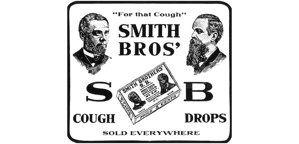
Historic Smith Brothers cough drops advertisement (1914, Public domain)
Packaging with added value
Packaging first began to be customised some 150 years ago, thus turning it into a means of communication. The trend of differentiation is closely related to the emergence of brands and the success story of advertising. Originally, a company’s name and images were used to attest to the originality and the quality of the packaged goods and to protect the goods from counterfeiting. This proved to be such a success that soon every company began to make their products stand out with a name. Unsurprisingly, the first advertising on packaging was in the USA when the Smith Brothers added their own faces to their legendary cough drops in 1866 as a guarantee of the product’s authenticity. The inventor of cornflakes, Will Keith Kellogg, pursued the same objective and added his signature to labels, boxes and newspaper ads as a guarantee of the quality of his product.
Names were then followed by slogans, informative texts and the first logos, usually in the form of abstract lettering. Later, packaging began to feature illustrations and advertising mascots such as Mr. Clean, Milka’s purple cow and Captain Birdseye. One of the first logos was created by the US biscuit manufacturer Nabisco in 1896 for its Uneeda Biscuit – the Uneeda Boy wearing a yellow raincoat. One year later, a tin can label which remains famous to this day first saw the light of day – the red and white Campbell’s Tomato Soup label, which the global pop art star Andy Warhol made timeless in 1962.

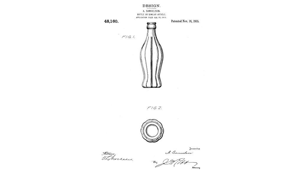
The iconic Coke bottle: Page from US design patent 48,160, Nov. 16 1915 (Public domain)
Competition is the mother of invention
Lithography printing processes, multicolour printing and other new techniques allowed the forms of expression to multiply, and packaging and labels became a key pillar of western consumer culture. To design their packaging, companies drew not only on the services of renowned designers and artists, but also on the very latests findings in the fields of psychology, neuroscience and behavioural science.
As the majority of manufacturers were advertising their brands and products visually via their packaging by the beginning of the 20th century, the shape of packaging was discovered as a unique selling proposition. This was a groundbreaking idea – these days, we are all familiar with iconic examples of packaging such as the Coca-Cola bottle which was unveiled in 1914 (be it made of glass or PET), the triangular Toblerone box, the Pringles tube, the Campari Soda bottle designed by the Italian futurist Fortunato Depero in 1932 and the Odol mouthwash bottle, which has remained virtually unchanged since 1893. Another milestone in packaging design was the reusable Nutella jar, which incidentally triggered a collecting rage and therefore became a veritable top seller.
Data and functions
These days, the medium for product names, brands and slogans also serves as a carrier of factual information. Packaging informs people about a product’s weight, contents and production time. Even so, the nutritional tables which have featured widely on foods since the 1960s did not become mandatory throughout the EU until 2016. Barcodes have featured on products since 1974, the first of which to be scanned was on a ten-pack of chewing gum made by the brand Wrigley’s. A connection to the digital world has also been forged in the brands’ relations with the consumers – whereas labels, or at least parts of labels, once needed to be removed from the packaging in order for consumers to participate in competitions or other promotions, these days it is increasingly QR codes that invite the consumers to interact directly, directing them from the products on the shelves to apps or websites. Something else which is gaining in popularity is augmented reality (AR).

Sustainability: design for recycling
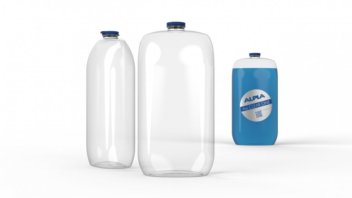
Sophisticated packaging design can also reduce the consumption of resources – a topic which is now more relevant than ever. Design for recycling is the buzzword. ALPLA is figuring out the potential for environmental protection that clever packaging shapes can offer in the area of plastics, for example, where it’s all about maximising the proportion of recycled material used by means of clever shaping. The characteristic design features such as caps, labels, adhesives and dyes are being carefully examined, as are the materials, additives, weight and refillability. At the new one-stop design shop Studio a, the ALPLA experts will work with product manufacturers to develop the optimum packaging solution – one which is not only functional and sustainable, but also as aesthetic as possible.
Do you like our texts? Perhaps even so much that you want to use them in your own media? Then please get in touch with us beforehand!
